
Our monthly series asks: How do you bring color into a luxury home? With plenty of heritage, bold red gets people talking, writes Jill Krasny
Canaan, New York | William Pitt Sotheby’s International Realty
Ever walk into a home and feel uplifted? Or more relaxed? It may be the colors in the design scheme at play. Whereas orange is energizing and blue feels soothing, bright red, which our series on color in luxury home design turns to next, elicits stronger emotions.
“People fall into a love-or-hate camp with red more than any other color, even orange,” says Lisa Shaffer, chief executive and creative director of Lisa & Leroy, an interior design firm based in Washington, D.C. “It really is the most energetic of all the primary colors.” It also has deep cultural associations.
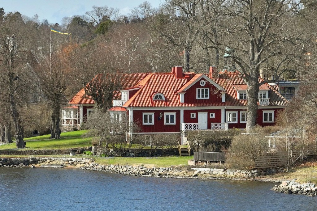
Stockholm, Sweden | Sweden Sotheby’s International Realty
In Sweden, where “Falun red” cabins trimmed in white dot the countryside, the paint—initially made in the 16th century using byproducts from copper mines—has come to symbolize the nation’s heritage. A former rectory, 20 minutes from downtown Stockholm, has lots of orange undertones in its warm red exterior, says Shaffer, which the terracotta roof helps draw out.
The bright white millwork also makes the color striking, she says, while the blue of the nearby water helps set it off. “It almost acts like an accent,” she says of the red shade.
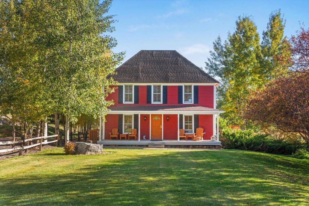
Snowmass Village, Colorado | Aspen Snowmass Sotheby’s International Realty
Set on 102 picturesque acres between Aspen and Snowmass Village in Colorado, Brush Creek Ranch has a similarly red exterior, albeit in a bluer shade. Here, the navy shutters pick up the undertones of the color, Shaffer says, modernizing the home in a cheerful way.
“It’s not a combination you see a lot,” she says, noting the unconventional choice of orange for the door and porch chairs. But the complementary navy of the shutters ties it all together, she adds.
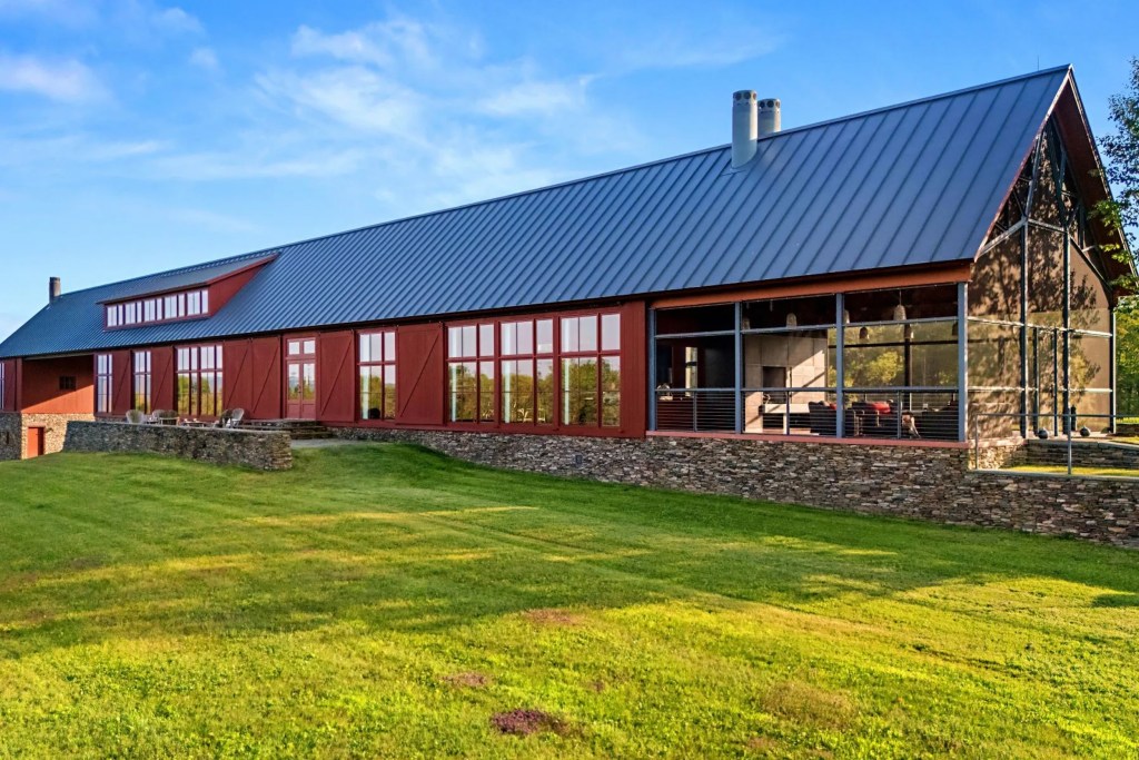
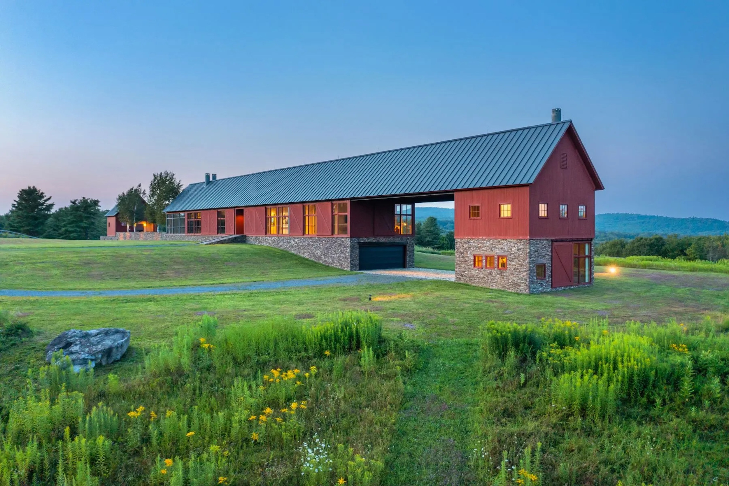
Canaan, New York | William Pitt Sotheby’s International Realty
Pierce Peak, a sleek “barndominium” property in Canaan, New York, that won architects Burr and McCallum the AIA award, turns the farmhouse archetype on its head. “Yes, it’s red,” Shaffer says, “but they asked: ‘How can we elevate this?’ and they chose a rust red, which I think is so pretty.” The clean lines—no porches or ornate gables here—and picture windows keep things modern.
The warm color also appears in the covered porch and the barn, which can be seen through the windows. “You wouldn’t typically see a red floor in a large format,” says Shaffer, but paired with industrial lights and beams, here it just works.
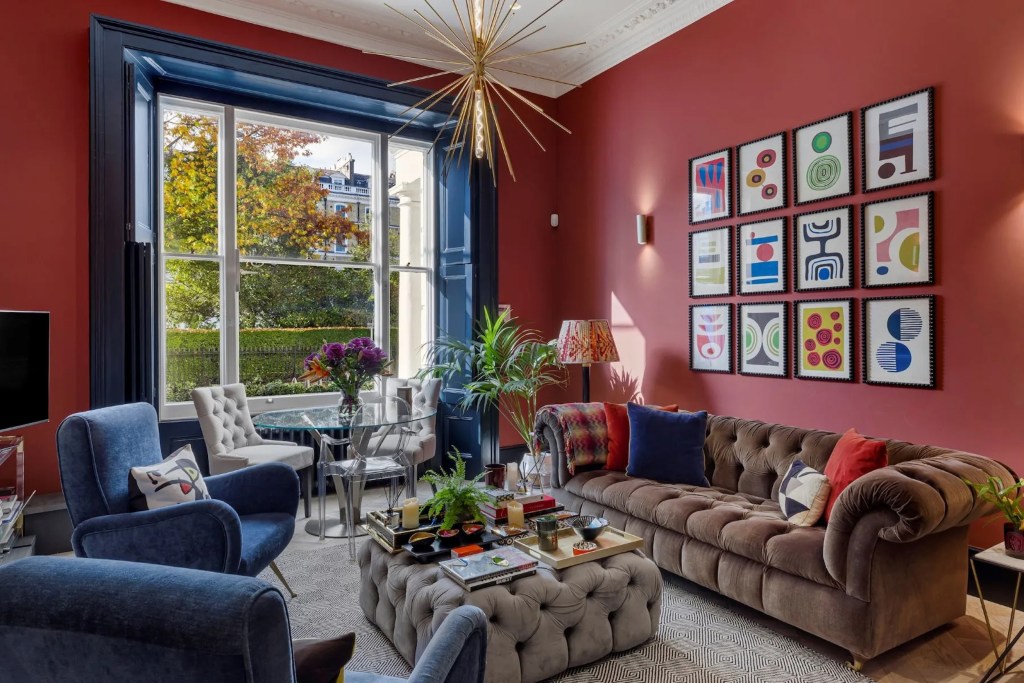
South Kensington, London | United Kingdom Sotheby’s International Realty
Red walls are commonplace in Victorian homes on both sides of the Atlantic, but the colorful reception room of this period apartment in South Kensington, London, exudes a contemporary charm. The furniture is kept relatively neutral to prevent the red from overwhelming, says Shaffer. And painting the ceiling “a nice fresh white” makes the space seem larger.
“There’s a real misnomer out there that when you do a bolder color, the room feels smaller,” she says. “When you take a color that bold all the way up to the ceiling, it really makes the room feel expansive.” Also helpful? The large windows with blue shutters and casing.